Data layer
Behavioral and market-structure indicators quantify greed-fear dynamics across the yearly cycle.
Methodology
Data layer
Behavioral and market-structure indicators quantify greed-fear dynamics across the yearly cycle.
Model layer
ML and pattern-recognition methods condense broad signal space into candidate turning-point windows.
Advisory layer
Portfolio managers receive clear risk-date outputs and structured hedge overlay guidance.
Turning Point Dates for Capital Protection (TP Dates CP) is a risk-management overlay designed for long-only, long-term institutional investors. The system uses machine learning, pattern recognition, and behavioural-finance metrics to distil roughly 250 trading days per year into a small set of ex-ante candidate dates on which the probability of a major market correction is elevated. These turning-point windows are identified ahead of time, are registered and non-revisable (±1 day), and are mapped to corresponding time-based price thresholds that act as support/resistance levels.
The methodology is rooted in the observation that investor greed and fear generate recurring, synchronised cyclical patterns that can be projected forward. Over more than two decades of back-testing, the approach has highlighted high-risk periods surrounding the COVID crash of 2020, the 2022 bear market, and the 2025 volatility episodes, while also providing opportunistic entry signals. The resulting overlay strategy is implemented with minimal intervention— typically via liquid futures and options—without liquidating core holdings or incurring major transaction costs.
We rely on a set of four core proprietary indicators to map out an ex-ante roadmap for the most important risk periods faced by stock markets during the course of each forthcoming calendar year. We have therefore a set of 4 core charts, all of which are calculated at the end of each calendar year, providing a roadmap view for the risks ahead. Also, all our core charts are derived by completely independent calculations, which means that results are reinforced in the presence of convergence - e.g. two or more charts pointing to the same time windows and / or conclusions.
The 12 TP Candidate Dates Dial Chart
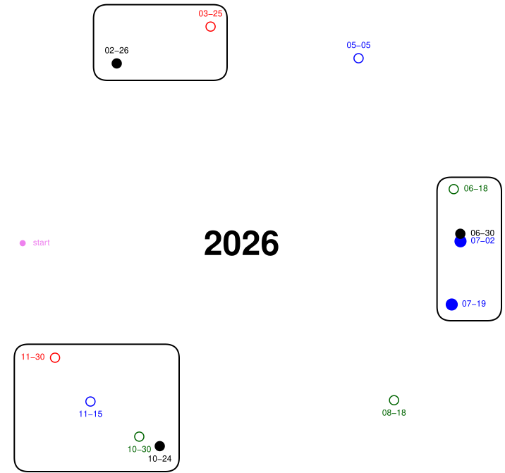
Important highs / lows in stock markets during the course of the year often coincide with (or are located close to) a few of our 12 turning point candidate dates. Out of 250 trading days, not all days have an equal probability of being a turning point when entering a new year. Our 12 TP dates have much greater probability than any other randomly selected date inside the year. We normally allocate our 12 TP candidates in three clusters to further refine periods within the year where price reversals for major stock market indices should occur. We do not know from this chart, however, which individual specific date out of the 12 candidates has the highest probability of being an actual turning point; we also do not know, ex-ante, whether any of the three cluster periods or even any of the individual dates will have higher probability of representing lows rather than highs or vice-versa. For these reasons, we have developed the other proprietary indicators as part of our overall roadmap for hedging tail risk.
The RF (Random Forest) Oscillator Chart
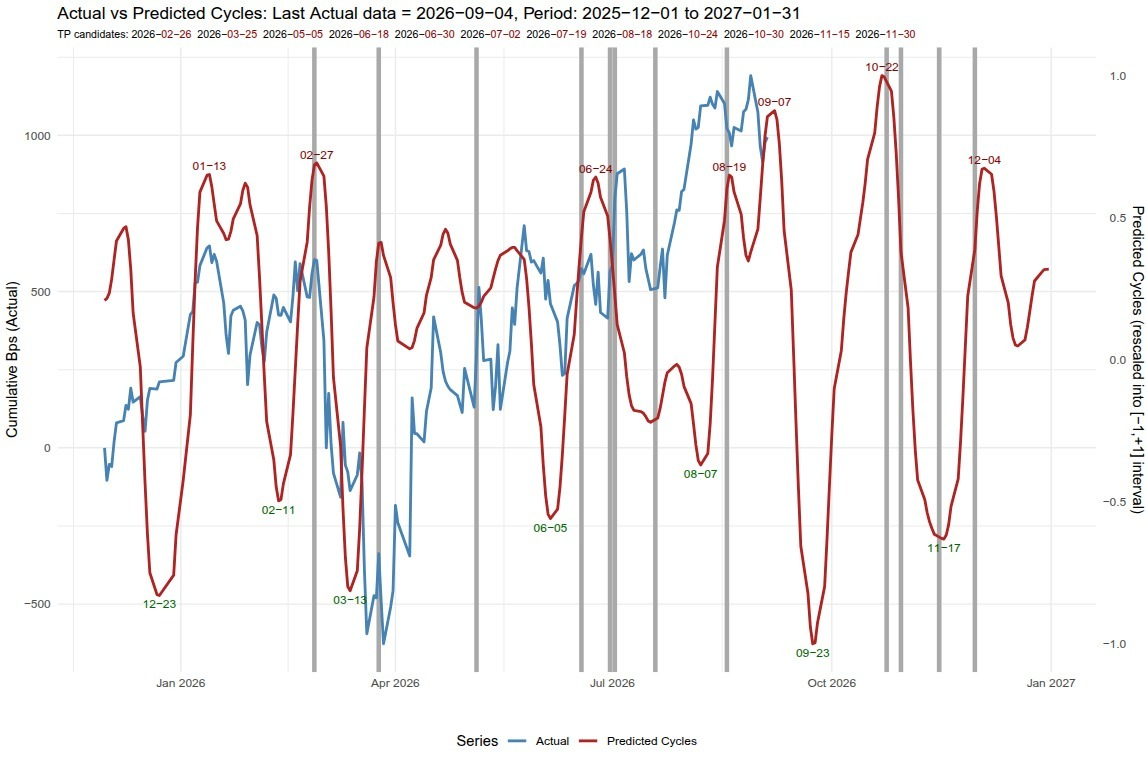
The 12 TP candidate dates extracted from the dial chart are plotted as vertical solid grey lines in the RF Oscillator chart, which also gives an oscillator line (red colour) obtained at the end of each calendar year (in-sample), making turning-point projections out-of-sample. So, for example, as the TP dial chart indicates 26 Feb (02-26) and 25 Mar (03-25) as the only two TP candidate dates in the first quarter of 2026 (2026:Q1), the oscillator chart indicates the date of 02-27 as a local high and the date of 03-13 as a local low. Hence, when we combine the information obtained from the two charts, we infer that 26-27 Feb is more likely predicted to be a high rather than a low and mid-March to the end of March is more likely predicted to be a low rather than a high. Similarly, another period in time where there is strong correspondence of dates (the level of correspondence is seen where peaks or valleys in the oscillator red line occur aligned with any of the 12 vertical grey lines) is the time window 20 Oct to 20 Nov, predicted to be "high to low" much more likely than "low to high" time period.
The Horizontal Boxes Heatmap Gantt Chart
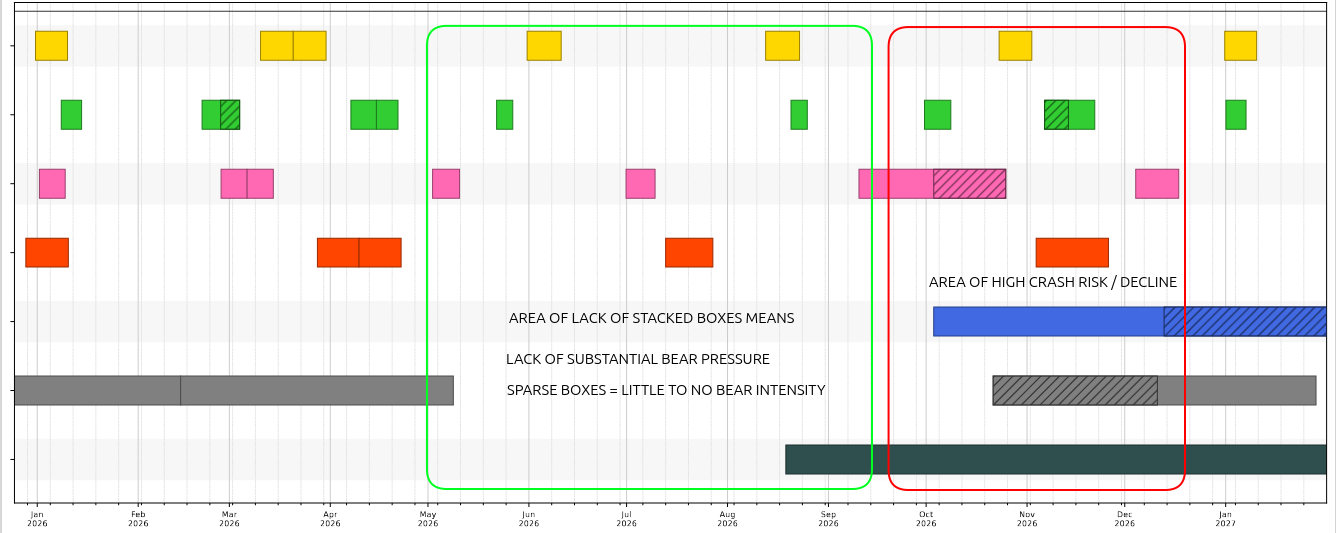
None of our 4 core indicators provide any information at all on the level of intensity of a market correction / decline, APART from the Horizontal Boxes Heatmap chart. This means that if TP dates and RF Oscillator both agree on 26-27 Feb as high probability turning point date for a price reversal to the downside (local top), none of the indicators will know in advance the level of intensity of the decline (so, it could be just a -5% or -10%, or any other percentage value). With the Horizontal Boxes Heatmap indicator, we still will not know the exact value of the decline but we will be able to assess in which time windows the intensity of the decline will be higher - this is still very useful information to have. In this Gantt chart, boxes of various colours indicate periods in time where risks for a market decline (specifically) are more active (activated). When a large number of these boxes display a pattern of "stacking" above each other, like during the mid Sep 2026 to the end of the year underlined by the large rectangular red box, that is when the risks of downside / market crash are highest (according to our research / analyses). In this respect, the period starting from around mid September to the end of the year shows much more intense risk, compared to the period from the beginning of May to mid September where horizontal boxes are very sparse (lack of intensity) and not stacking above each other. Among all months in the year, the month of November appears to be of the greatest intensity / risk. And this is during a time window in which there is a very high level of convergence with the inference drawn from the previous two charts / indicators.
The Special Situations Volatility Fast Price Reversal
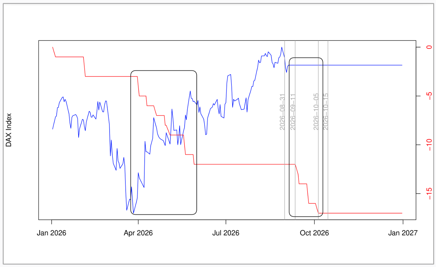
The Special Situations Volatility Fast Price Reversal line (red coloured in the chart) indicator identifies periods of potential fast price reversals in those time windows during the course of the year where the line shows marked decline (vertical rectangular black boxes). The indicator knows the time windows ex-ante, but one has to wait to around the start of the time window to establish whether the price reversal will be to the upside or to the downside. Around the end of March 2026, for example, the DAX index represented by the blue line was in an extreme oversold position; therefore, only then (at that point in time) indicating that the price reversal would be to the upside. As of around 10th September, on the contrary, the DAX index trading very close to highs indicates a price reversal to the downside.
We are now in the position to combine / cross reference the information provided by our four core proprietary charts to give tail-risk predictions for different time windows during the course of the year 2026.
Taking the 12 TP dates dial chart as our main reference starting point, we have 3 clusters located at: last month of Q1, early summer (mid June to first week of July) and the Fall (20 Oct - 30 Nov).
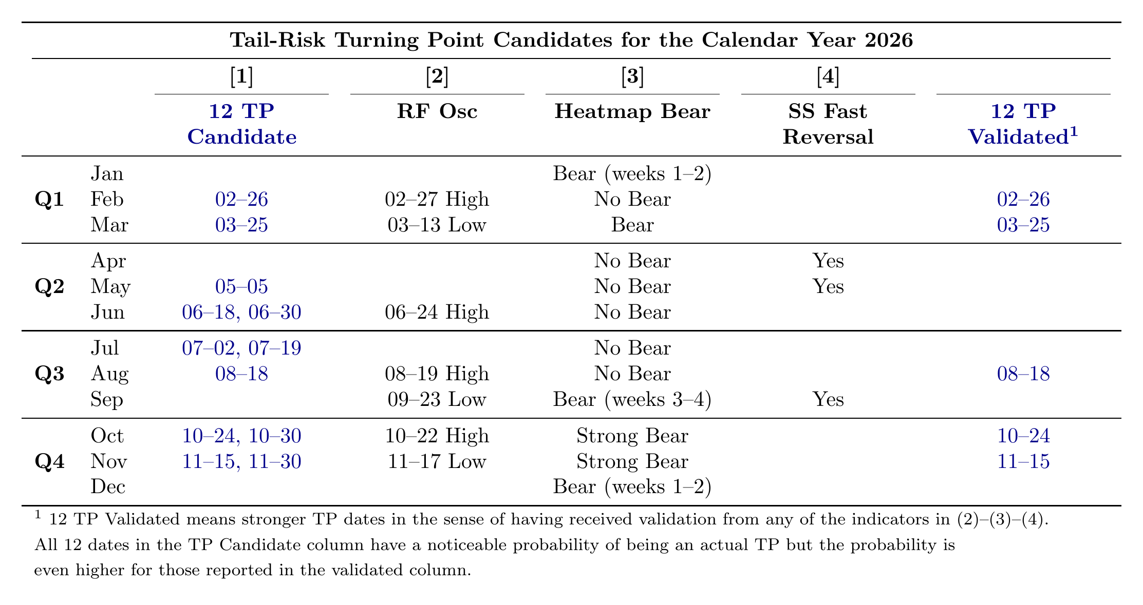
The early summer cluster is not validated by the heatmap chart displaying extreme sparsity of horizontal boxes, indicating lack of severe bear market pressure / activity during the period May to mid September. The Fall cluster, on the contrary, is fully validated by the heatmap chart as a time window of high probability market crash risk. The Q1 cluster is validated by the RF oscillator assigning high probability for top formation around the end of February.
The Special Situations fast price reversals chart indicates that if the end of February local top prediction is confirmed in practice (which ex-post it was, as we are writing this on Sunday Sep 13 2026), then fast price reversals time window period of April-May strictly recommend hedge overlay off action - no shorting of futures to take place to protect the long portfolio holdings / investments. The same recommendation continues through the June to August months due to lack of heatmap chart bear intensity.
Among the two dates in the 12 TP dial chart falling outside the three clusters, the 18-08 date is validated by the RF Oscillator 19-08 prediction as potential high.
In summary, the dates to initiate hedge overlay on tail risk protection in 2026 are predicted to be: end of February, beginning of September and mid October (also looking at the RF chart). Probability of a market crash is very high in the last quarter of the year - with month of November looking particularly severe.
We would like to draw attention to how our advisory service prompts to just a few focused decisions during the course of each calendar year, which have the potential to secure large pay-offs to the institutional investor - with maximum possible reward given by the amount of AUM multiplied by the percentage points of the crash, for every correctly predicted crash time window.